Hoxe e sempre
contra a violencia de xénero
Cartaces realizados polo alumnado
CARTACES REALIZADOS POLO ALUMNADO

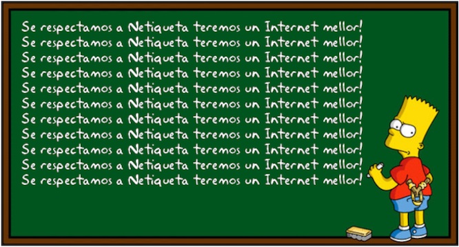
Viñeta de Bart Simpsom: Se respectamos a Netiqueta teremos un Internet mellor!.
Agustín Carracedo. CC BY-SA 4.0. Imaxe xerada en addletters

Less check this example:
We all recognize the green triangle and the characteristic letters of El Corte Inglés, it is something unmistakable, this logo certainly works very well.Let's see the changes since 1909:
At the end of the 1940s, the great change in the shapes of the logo's letters took place (fourth logo starting at the top), it is the moment in which the essence of the characteristic typography of El Corte Inglés is defined. Years later it would be perfected and athicker font would be designed.
However, it is not until 1961 that the well-known triangle appears in an advertisement in the ABC newspaper on Christmas Eve.
The triangle at the beginning was black and it was not until the 70s when green began to be used.